A Mini-Exploration of the New LinkedIn Desktop User Interface
LinkedIn has been rolling out a new desktop user interface. You may already be “part of the new experience” as the networking platform puts it. I’m now part of the new experience, and I have mixed feelings about it. Like with most changes, there are good things and bad.
If you’ve also been using LinkedIn’s mobile app, it shouldn’t take you too long to navigate the new desktop version. One thing you may like when you receive the updated desktop version is the cleaner layout. For example, there is no longer two menu bars at the top of the page. The single menu bar makes much more sense.
To not overwhelm you, I’ve set out a few areas to familiarize yourself with getting to know where things are on the updated user interface. Have a read even if you haven’t received the update yet. You may be interested in the March 31, 2017 deadline I mention below. [Update: LinkedIn has extended the March 31, 2017 deadline to May 31, 2017.] You may also want to do some things before LinkedIn transitions you over, as some functionalities will be temporarily unavailable upon the transition.
1. Viewing Your Profile
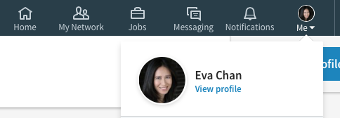
To view your profile, click on the “Me” tab in the menu bar, which is located at the top of the page and shows your LinkedIn photo. Then select “View profile”.
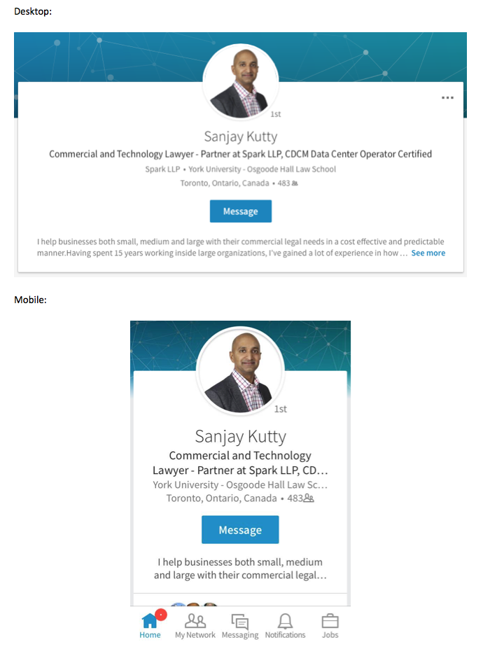
In this new interface, you’ll notice that some of your content have been collapsed. To read all of the text in a collapsed section, you’ll have to click “See more”, “See description” etc.
For example, the Summary section is an area where readers can only see the first two lines of your text. So it’s important to review the beginning of your Summary to see if you can improve it to compel readers to click on “See more”. Summaries viewed on the LinkedIn mobile app show even fewer characters at the top of your profile.
I’ve noticed that the text of the top entry in one’s Experience section is shown in its entirety on the new desktop version. So review that entry as well. It’s an opportunity to grab the attention of a reader who scrolls to read more but may not click to see more.
2. Editing Your Profile.
To edit your profile, go to your profile. Then click on the pencil icon next to the section you want to edit. If you don’t see a pencil icon, hover over the entry and the icon will appear.
If you want to add an entry to a section, click on the “+” sign in the relevant section. If the section doesn’t appear in your profile, look to the right of your profile for a blue bar stating “Add new profile section”.
If you haven’t received the new user interface, you may want to re-order entries within a section of your profile. At the time of publishing this post, re-arranging the order of entries in the Experience, Education and Publications sections is “temporarily unavailable” in the new desktop experience according to LinkedIn. You may be asking why you would want to re-order your entries? For the Education section, the entry at the top of that section is the one shown at the top of your profile just below your headline. For instance, when I added my recent Harvard Extension School experience to my Education section, by default it became the top entry in that section. It also replaced Osgoode Hall Law School showing under my headline at the top of my profile. So I moved the Osgoode Hall Law School entry above the Harvard Extension School entry, and was able to get the law school reference back under my headline.
To re-order entries within a section while you still have the old desktop user interface, go to the entry you’d like to move in your profile. Click and hold on the “up/down” arrow and drag it to where you want it to appear.
Although my re-ordered entries within a section have remained in my desired order in the new experience, the re-arrangement of my profile sections did not. For example, in the old desktop experience, I had moved my Honors & Awards between the Experience and Education sections. Now the Honors & Awards section appears near the end of my profile as part of the Accomplishments section. From quickly looking at some other profiles, it looks like LinkedIn has made the order of the profile sections uniform across all users. LinkedIn states, “If you’re a part of the new experience the ability to reorder your profile sections is temporarily unavailable.”
3. Sending Invitations to Connect
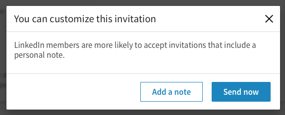
To send an invitation to connect with someone, go to the person’s profile page. You can find someone’s profile by typing his or her name into the search bar at the top of the page. On the profile page, click on “Connect”. You will get a pop-up message indicating that you can customize your invitation.
Unlike in the old interface when you were typing your personalized note, there is now a counter so you can see how many characters you have left as you type. This will help you avoid drafting a long note on how you two know each other, only to have to edit it when you try to send it. The limit is 300 characters.
If you want to send a personal note to someone, which is highly recommended, don’t connect with the person from LinkedIn’s “People you may know” section (which is found under the “My network” tab). By clicking “Connect” on that page, LinkedIn won’t provide you with an option to send a personalized note. Instead LinkedIn will immediately send off your invitation to connect. To avoid the instant send, click on the person’s name or photo to reach his or her profile, and then click “Connect”.
4. Sharing Posts
The field to share an article, photo, or update is at the top of your feed on your homepage.
When you click on “Share an article, photo, or update”, LinkedIn indicates that you can use the “@“ symbol to mention someone. By mentioning a LinkedIn user in this manner, s/he will be notified of your mention. Also, that mention will result in a clickable link in your post for others to easily access the mentioned person’s LinkedIn profile.
If you want to create a long-form post, click on “Write an article” under “Share an article, photo, or update”.
5. Editing Posts
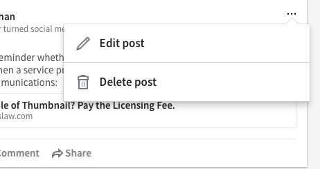
If you want to edit a post you shared, go to your profile and look for that post in the “Your Activity” section. You may have to click on “See all activity” in that section to find the desired update. If you have to do so, click on the “Posts” tab and the “…” in the upper-right hand corner of the desired update. There will be an option to “Edit post” (along with “Delete post”).
You can then edit your post and click on “Save” to save your changes. Note that an edited post will indicate that it has been edited.
6. Reviewing and Organizing Your Connections
To see your connections, click on the “My Network” tab. On the left side, you will see the number of connections you have, and a link titled “See all”. Your connections will be listed based on the most recent addition first. You can also sort by first name or last name.
One of the biggest disappointments with the new user interface is the loss of the Relationship section. This section housed the Notes and Tags you created. Notes are the information you had typed about a LinkedIn connection (e.g., how you met, what you last spoke about, etc.). Tags are keywords you created to organize your connections (e.g., by company name, event met at, etc.). Without Tags, we’ve lost some efficiency in finding certain connections.
It is possible to keep a copy of your Notes and Tags, which you can then view, search and organize using Excel. LinkedIn states that “you’ll have the option to do so through March 31, 2017.” [Update: In March, LinkedIn extended the March 31, 2017 deadline to May 31, 2017 regarding the data download.] To download this information, click on the “Me” tab and select “Settings & Privacy”. Then scroll down to “Getting an archive of your data” under the “Basics” section under the “Accounts” tab.
Don’t let the new desktop experience deter you from using LinkedIn. Take the time to explore, listen and engage. LinkedIn is still a valuable platform if you use it in a SMART way.

