Update Your Profile Given LinkedIn’s New Profile Look
Did you notice your LinkedIn profile looks different? There is no better time than now to review and update it.
Below I set out some of the changes you’ll notice when you look at your LinkedIn profile on desktop. Before reading about those changes, for your ease of reference, here’s an image showing what the top of my LinkedIn profile looked like before the new profile look:
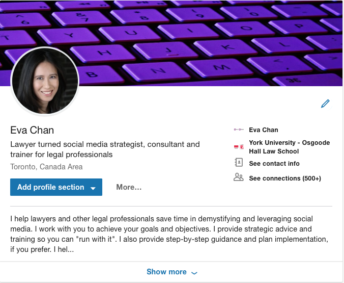
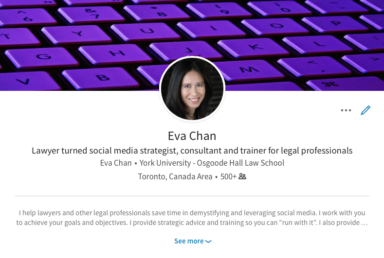 This image shows what the top of my LinkedIn profile currently looks like:
A lot of information is presented at the top of one’s LinkedIn profile. It is much easier to read and absorb the information presented in this new layout.
1. LinkedIn Photo
Your LinkedIn photo has been shifted from the centre to the left. It’s located in a similar area as you would find your photo in your Twitter profile and on your Facebook page.
Take a look at whether this shift affects what you see in your background photo. If your photo now covers something you want users to see, you’ll want to change or adjust the background photo. Click on the pencil icon underneath the background photo and then click on the pencil icon in the upper left-hand corner of the background photo.
Keep in mind that your LinkedIn photo is still centred on the mobile version.
2. Separation of Information
Your name, professional headline and location have also been shifted from the centre to the left underneath your background photo.
Where you work and went to school, as well as the link to your contact information and how many connections you have, are now on the right underneath your background photo.
3. Contact information
You likely didn’t even realize that your connections can view your contact information, as the link to access it used to be in the sidebar.
Click on “See contact info” and see what contact information you’re providing to your connections. Click on the pencil icon to update the information and see what information you could add.
If you’d like to restrict who can see your email:
- Go to “Settings & Privacy”
- Click on the “Privacy” tab
- Click on “Who can see your email address”
- Select which option you prefer, namely: Only you, 1st-degree connections, 1st and 2nd degree connections, or Everyone on LinkedIn.
4. Summary Excerpt
Before this new profile look, the Summary section only showed the first two lines of your Summary. Users had to click on “See more” to read your Summary in its entirety.
The updated look shows a little more than three lines of your Summary. Users would have to click on “Show more” to read your Summary in its entirety. So there is more opportunity for you to relay your value on the first screen. Keep in mind that only the first two lines of your Summary are still shown in the mobile version.
Put yourself in your audience’s shoes. Do you think the first few lines of your Summary compel your audience to click “Show more”?
5. Profile Sections
Adding a profile section is much more noticeable now with the blue button underneath your professional headline and location.
Since you last updated your LinkedIn profile, have you had any new work experiences, education, or volunteer experiences? What about accomplishments such as publications or awards?
Schedule a time now to review and spring clean your profile.

